What tool for the job?
I’m a big fan of many wildly different eLearning development tools, but how do you decide which to use for a project? This story is going to meander a bit and think about that question, but it’s not going to answer it, I’ll warn you.
Project constraints and organizational expectations will dictate a lot of this in organizations, and what you want to “show off” will inform your choices in building hypothetical pieces. I design in Storyline a lot because it has given me a fun place to show work for eLearning Heroes, and because it’s the most common tool at my LXD job. So, I often “think” in Storyline first. But I have designed for other tools too!
I dusted off an old project I used to have on my portfolio when I was first breaking into instructional design, and I wanted to redo it in the same medium (Storyline) with some updated graphics I made and edited. You can explore both versions below for context if you want. It’s a microlearning, so each one should take just a few minutes!
vs.
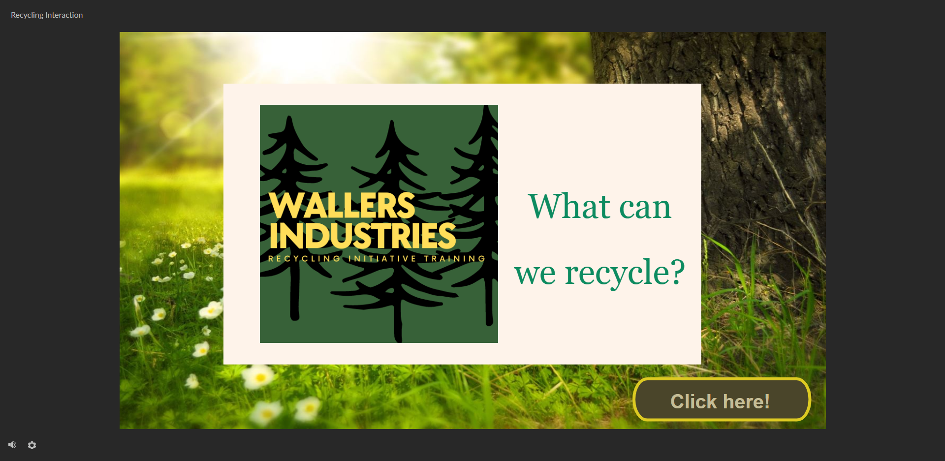
The Cover of the Old Course: I kept the logo mostly, though I gave it a “glow up” too. This is a hypothetical company. The idea is to create a microlearning for their recycling program—pretty straightforward and based on a case study I found online and some research I did on office recycling.
Alt text: The background is a soft golden light on green grass and small flowers, with a tree trunk barely visible. There’s a green, black, and yellow logo for Wallers Industries (green background, black trees, yellow text) that says “Wallers Industries: Recycling Initiative Training” next to the text “What can we recycle?” and a button that says “Click here!”

Directions for the Old Course: I actually centered the text here on someone’s advice, and I hate it so much now. The button text is wrong and not aligned, and just so, so much wrong! All the icons give me a “PowerPoint clipart” vibe. The directions here are way overcomplicated too.
Alt text: the directions state “You will be presented with common items in our office” and then show the recycling icon (green on blue background) and a red X (on blue background). The text there says, “Select the button with the recycling symbol for items that CAN be recycled” and “Select the button with the X for items you think cannot be recycled”.
A brief video that shows the interactions in the original microlearning, which used landing slides and navigation because I had not figured out you could edit feedback layers in the Master Slides yet!
Alt text: The video has slides that look like PowerPoint slides. Each one has two icons, one for recycling (the recycle symbol) and one for no (a red X). The user quickly clicks through several screens, showing Printer Cartridges are recyclable and that coffee pods are not. The design is not inspired and the text is weirdly centered.
Redesigning a Good Concept
The course was a good idea, but the design needed significant work. The “glow up” itself was both fairly simple and a little involved. I got the idea that I wanted an illustrated style, which meant some editing to create the cohesion I wanted and the look/feel from the assets I had. I used Adobe Illustrator to edit the graphics and was able to find many of the pieces on Canva to put together. Sometimes I “removed faces” because the facial art style was just inconsistent, and that seemed a potential solution. The assets were laid out in Canva. I have used PowerPoint and Adobe XD for that purpose before, but I wanted to see if Canva would work and it actually worked out quite well, though it meant writing alt-text for the Storyline as a lot was downloaded as composite images, something I wouldn’t do in a longer or more wordy eLearning but that worked here.

The Storyline screen where learners can check their knowledge on whether the item is recyclable or not.
Alt text: ILLUSTRATED— A man with glasses and black hair, wearing a yellow sweater and jeans, sits at a table holding a clipboard. A woman in a skirt and red shirt sits at the end of the table. Above them are bookshelves holding books, file folders, and plants. Behind them are gears decorating the walls. On the table, prominently, are disposable coffee cups. A picture off to the side says “Coffee Cups” and shows a similar but slightly different disposable cup. Below it are two icons: a recycling icon in green and a no sign that is a circle with slash in red. The screen asks the learner to choose one of these and submit.
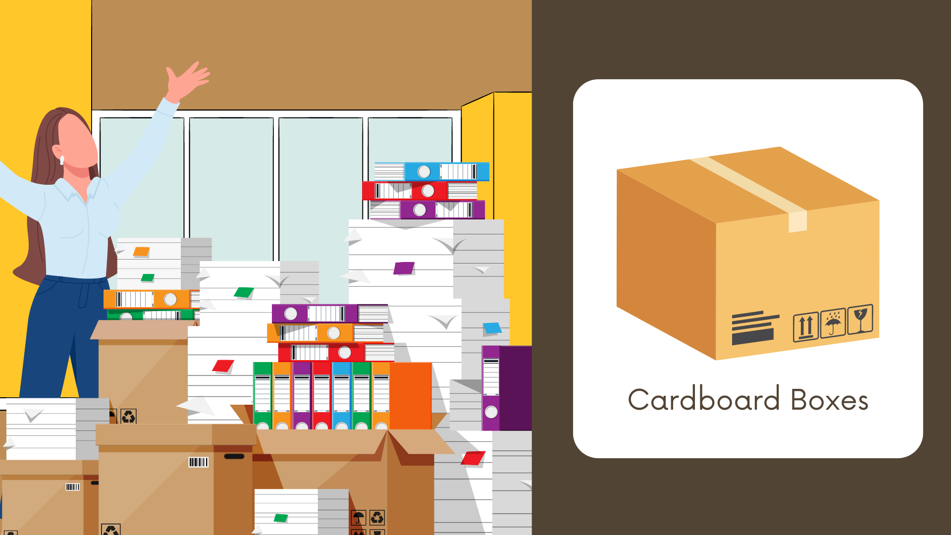
Alt text: ILLUSTRATED— a brunette woman stands in business wear (light blue button up, silver earrings, blue dress pants) in an office with a yellow wall. Both her hands are up, as if in either frustration or triumph, with no facial expression, it’s hard to say. A pile of papers and binders overflowing from boxes is in front of her. A picture of a cardboard box that says “Cardboard Boxes” is next to her. This shows the design before it was turned into a quiz screen.
Challenging the Concept: Is the Development Time Worth It?
This was designed as a Storyline sample, meant to practice the tool, so I never questioned, “What is the best medium for this learning?” But I did wonder, even though it only took me about 6 hours to source, edit, and lay out the graphics and another 2 hours to plug it into Storyline (which is pretty rapid for eLearning, even a short one), “Was this all necessarily helping?”
Granted, I wanted the same look and logo, to maintain the branding/feel, so another tool didn’t save me much time because the graphic sourcing and editing took the longest. Though I certainly could have gone with the 7taps built in Upsplash pictures and had something in easily an hour or two if I hadn’t wanted to customize the graphics.
As a thought exercise, I spent another 30 minutes (2 hours vs. 30 minutes, a fair % difference) creating a 7taps. To be fair, that would have been even faster if it didn’t take me 5 minutes to figure out the images needed to be resized and 10 minutes to resize them all for mobile sizes on 7taps.
In the end, I think the Storyline course is a little more engaging and the extra time there is worth it visually for a sample piece, but I do think the concept could be delivered more quickly — with less “fancy” graphics — in a 7taps, probably to a similar training outcome. I also think it would still be better than my initial clumsy Storyline!
Check out the 7taps for yourself below!

Alt-text: 7taps Opening Image: What can we recycle? Click to open the learning experience.
Next step with both of these samples is to see if I can get some xAPI data from them and…. do something? I’m in the xAPI cohort and not sure what I want to do with this blossoming knowledge yet, but stay tuned! In the meantime, I’m liking this glow up and also the thought experiment of “When does production value matter?” and when would a speedy tool like 7taps be a better fit.
For the record, don’t ask me to choose a favorite between Storyline and 7taps because I want all the tools! 🤣
You can see more about the full glow up and project write up on on the project page here: